As the Creative Director, I was tasked with leading the creative direction for T-Mobile’s site re-design. I led a team of 14 designers and copywriters, and over the course of 5 months, we developed a look, voice, and style that we then applied to 100+ individual pages. My team and I refreshed T-Mobile’s entire web presence and set up their in house team with the tools to continue the direction themselves.
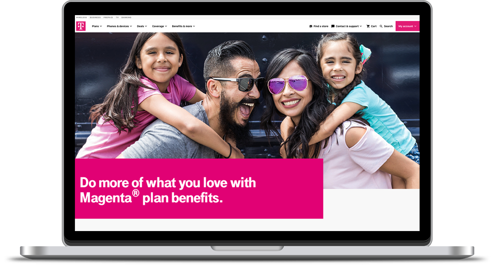
Until recently, T-Mobile did not have a cohesive visual identity or a proper site hierarchy. Our first task was to audit the entirety of their web presence, categorize the pages into groups, and then determine the best way to not only organize the pages themselves, but to also create a visual direction, all within the Adobe Experience Manager (AEM) platform.
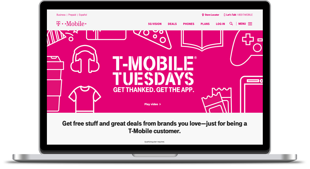

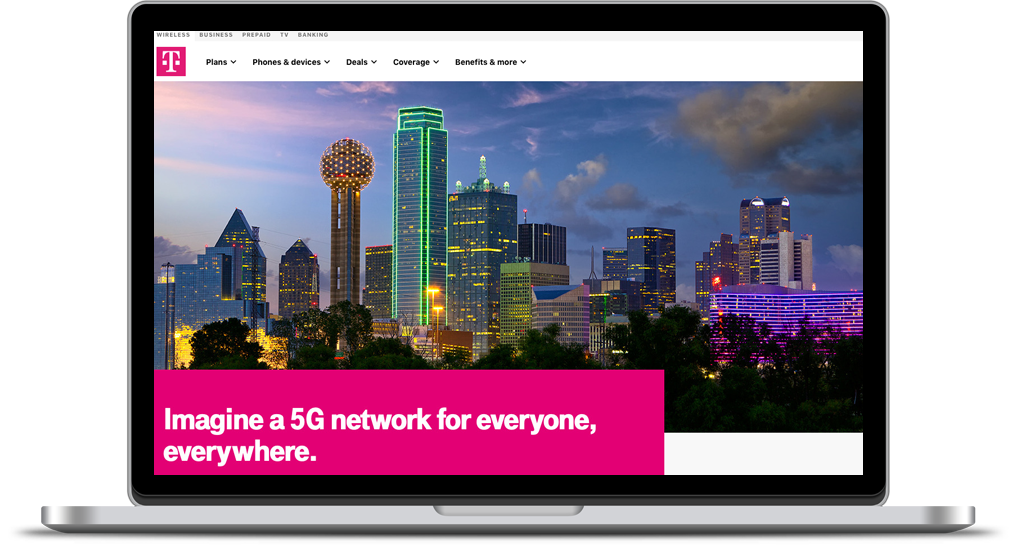
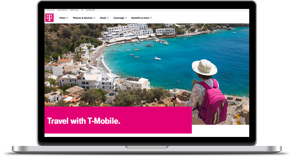
Working closely with a development team, one of our main priorities was making sure the site truly upheld the mobile-first philosophy. Each individual page was designed with mobile in mind, and custom code was implemented to give us more control of the visual layout within the AEM framework.


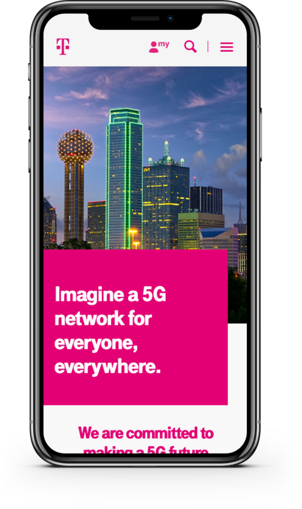
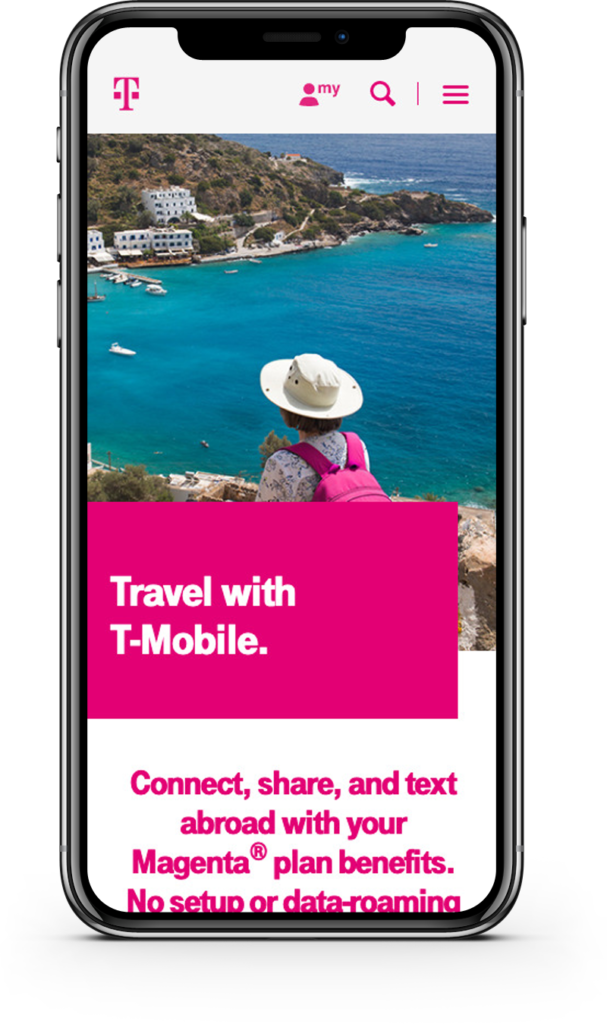
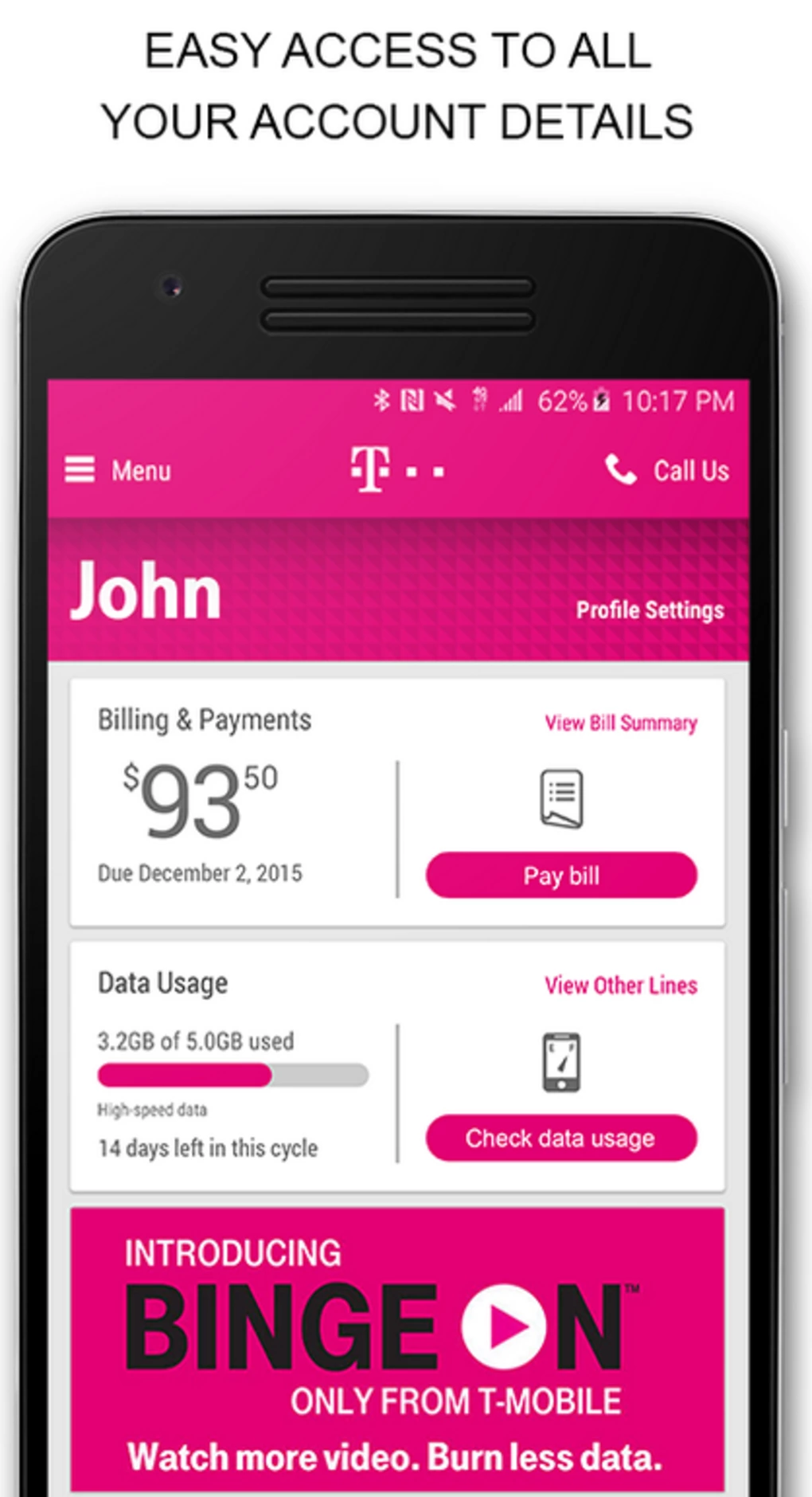
Not only was this for the web, but our changes cascaded over to the app as well. Re-designing the app alongside the web experience gave us the design freedom we needed to create a holistic experience for all end users.
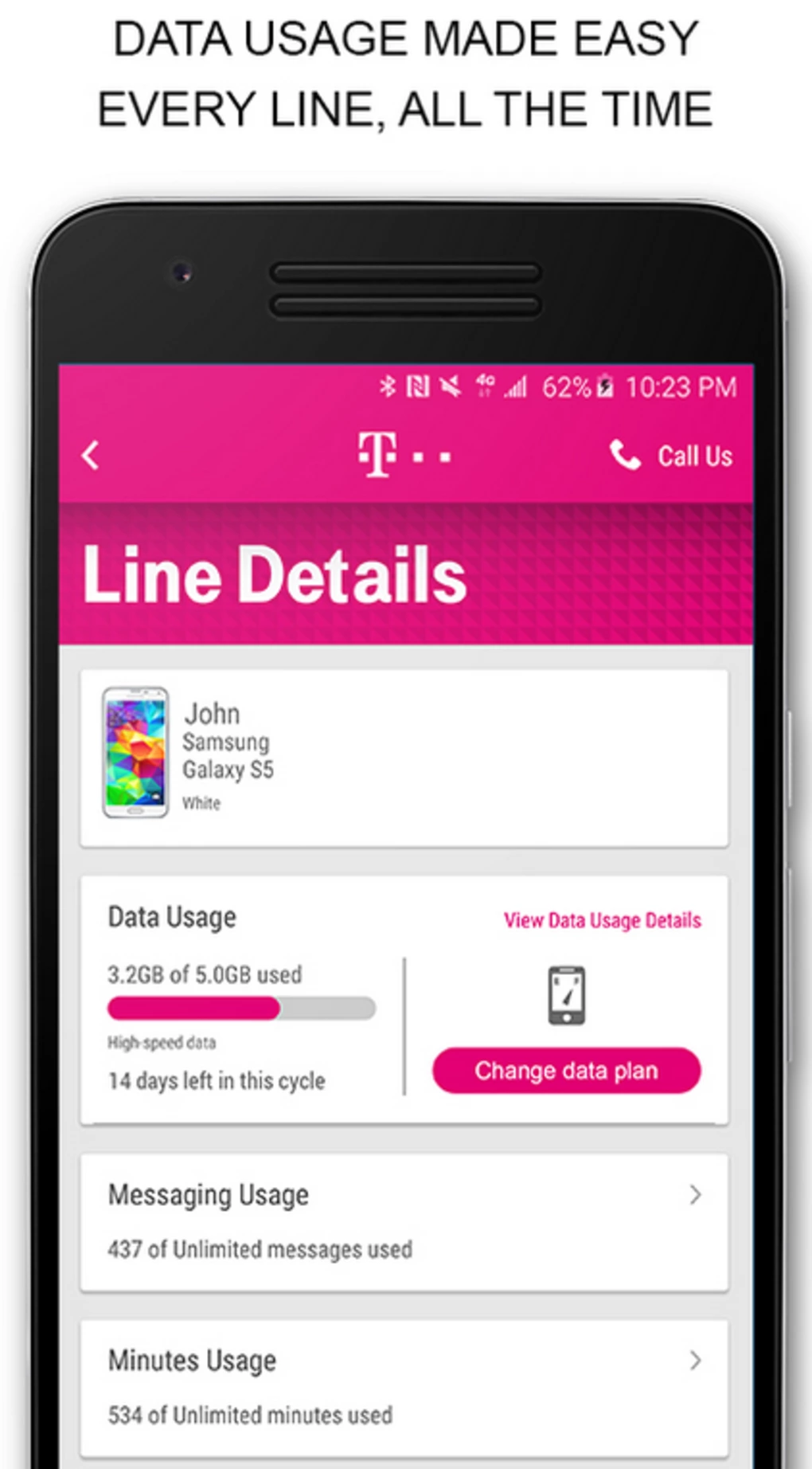
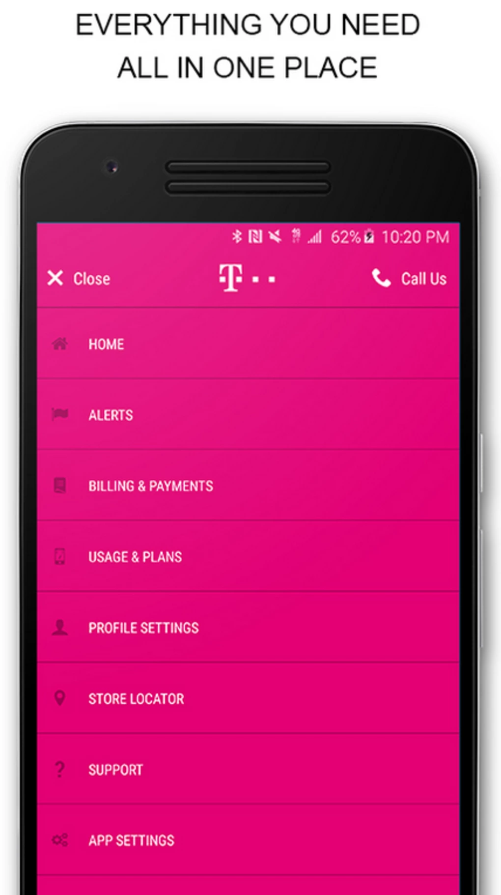
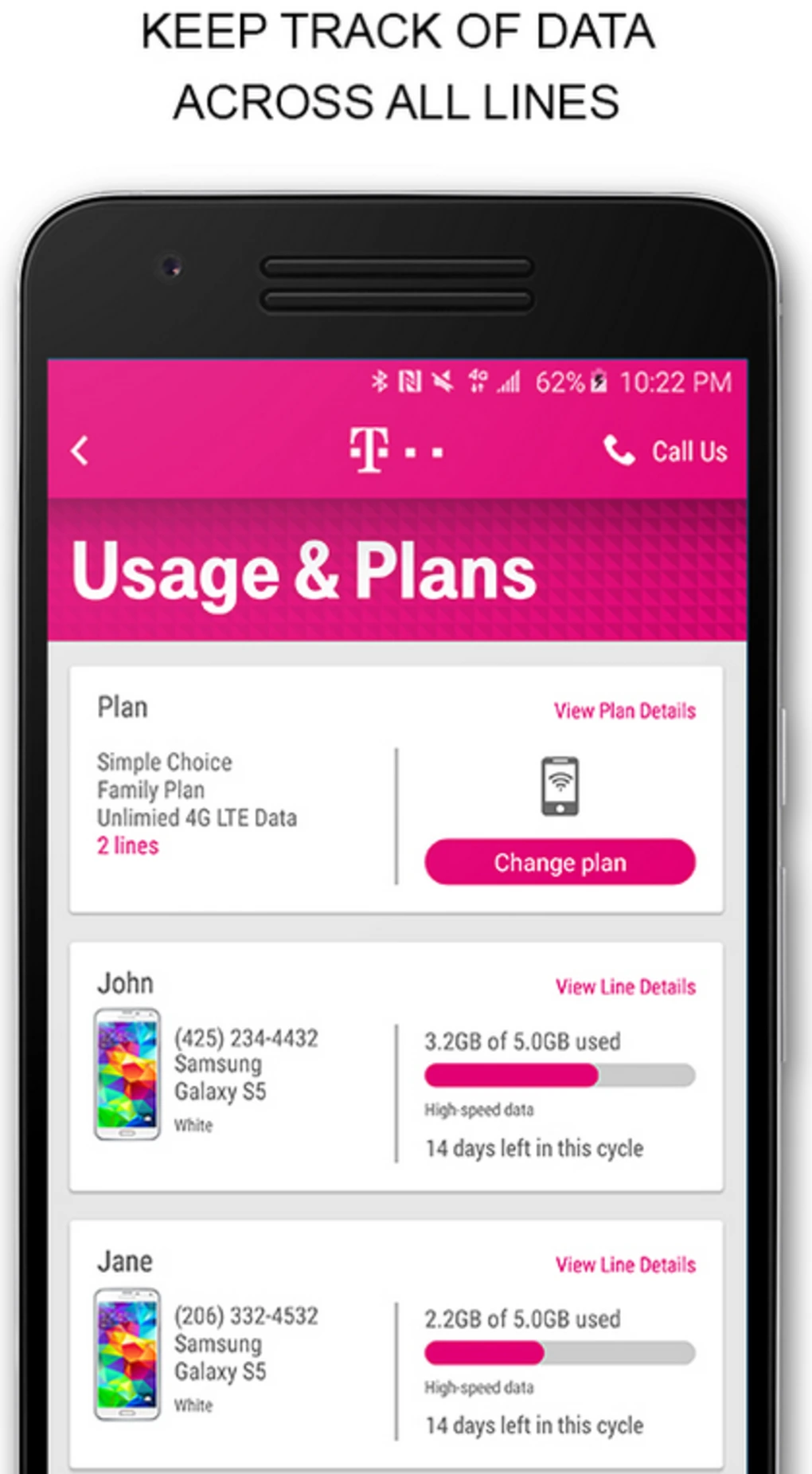
T-Mobile was able to walk away with a complete site audit, a content re-org, an updated voice that not only felt familiar but was also a natural progression in their brand, as well as an updated visual direction that has the potential to grow with their changing company. The new cohesive design and voice provides current and potential customers with an easier UX experience resulting in a higher number of acquisitions.


